All you need to know about Wisej Icon Packs
Wisej gives us a great flexibility to handle images in a Wisej application. A nice way to deal with images is to use Icon Packs. I think they're useful because they allow you to have all the pictures in an own assembly and you don't have to fiddle with strings in the code anymore. Instead, you can use the dot notation. As you know, strings are always error-prone because of the typos.
So, in this article, I’d like to show you
- how to get existing Wisej Icon Packs,
- how to use them and
- how to create an Icon Pack yourself.
Nearly each control has these two properties: Image and ImageSource. The Image property can be used as in WinForm – you can assign an image object to it. To the ImageSource property you can assign an URL, an image from a theme or an image from an Icon Pack.
How to get and how to use Wisej Icon Packs
Several Icon Pack extensions are now available for Wisej. Among them, there are currently:
Wisej.Ext.ModernUI
Wisej.Ext.ElegantIcons
Wisej.Ext.MaterialDesign
Wisej.Ext.VisualStudioIcons
Wisej.Ext.FontAwesome
All IconPacks can be downloaded from GitHub. You can easily check out and compile these projects to use them in your projects afterwards.
How that works in detail, I’ll show you in the following.
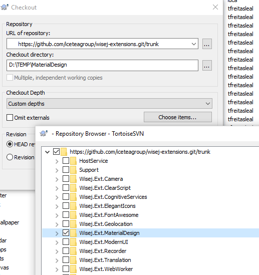
You can clone the Github repository or download a zip file with all Wisej extensions. I use and download only the MaterialDesign solution for my example.
Now I can open the Wisej.Ext.MaterialDesign.sln file with Visual Studio and build the solution.
The next step is to create a new Wisej web application and add a reference to the Icon Pack assembly.
In my 'IconPackDemoApp' project, I add a button and a ListView control to the form. After that I will add ListViewItems to the ListView control and use the images from the Icon Pack. Therefore, I add a new ListViewItem and set the ImageSource with the ImageSourceEditor.
On the first tab of the editor, in the folders area, you will find the Wisej.Ext.MaterialDesign. When you click on it, Wisej will load all images from this Icon Pack. This may take some time, but only once, because Wisej will now cache the Icon Pack’s images.
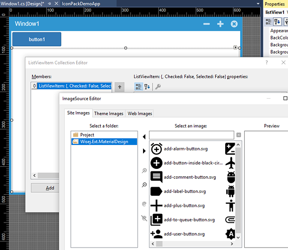
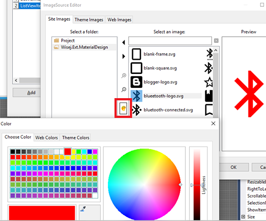
A nice additional feature of the ImageSourceEditor is, that you can change easily the color of SVG images.
If you take a look at the ImageSource property now, you’ll see that the Designer has assigned a URL to the property:
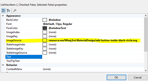
The Designer has converted our selected image into a URL. So, Wisej will load this image from a URL now.
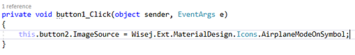
Perhaps you are asking yourself right now: "What’s the advantage of this? If I take a picture of the theme, I just need to assign the name to the ImageSource. And now I have to write much more code..."
That’s how the Designer resolves the ImageSource from the Icon Pack. We can simply use our dot syntax to assign an image from the Icon Pack to a control. That is a big advantage, because we don’t have to use strings in our code behind to assign images to controls.
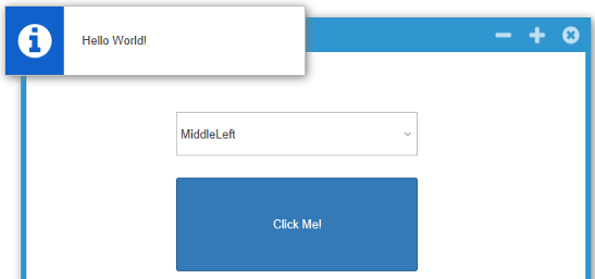
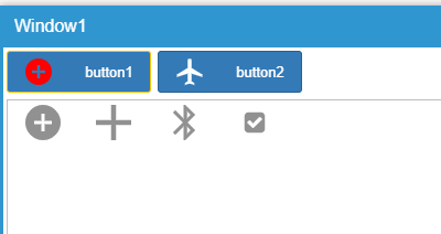
The demo app should now look like this at runtime. When you click the first button, it will change the ImageSource of the second one.
How to create your own Icon Pack
At last, I want to show you how simple it is to create your own Icon Pack.
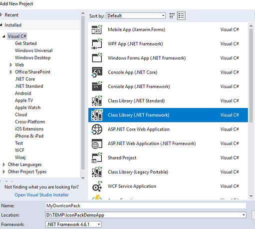
Build a new class library project in Visual Studio and name it:
My project is called 'MyOwnIconPack'.
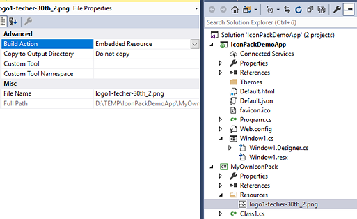
Add a new 'Resources' folder to your created project. In this folder you can add your images and set the Build Action to 'Embedded Resource'.
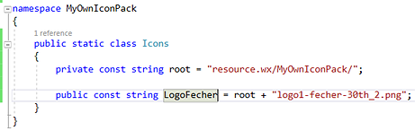
As a last step, add a new static class and put the following code in it:
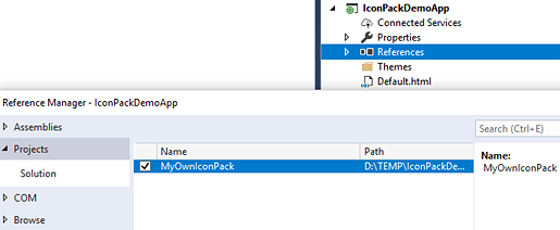
Now that you’ve built your Icon Pack, you can add the reference to your demo app.
Please note: You must add the IconPack as assembly reference and not as project reference – otherwise the IconPack won't be shown in the Designer's ImageSource Editor.
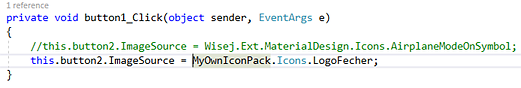
It’s time to use the Icon Pack in the demo app. In my example, I want to replace the button2 icon with an image from my Icon Pack:
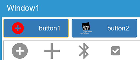
And here is the result: