Responsive Design with Wisej: Responsive Properties
Migrating a desktop application to the web, which is then implemented with the web framework Wisej, brings you many benefits – such as the application being accessible from any device with an Internet connection and a browser.
In most cases, users of a modernized desktop application want to use their new web application from devices with small screens. But the problem is: It is impossible to fit the same UI from a desktop application form inside a mobile browser just by simply migrating the desktop application to Wisej. To make the application usable on small devices, Wisej added a very helpful feature that allows you to design your forms for different screen sizes. This feature is called Responsive Properties, and is available since Wisej version 2.0. Responsive properties can also be used when you build a new Wisej application from scratch (not just when you migrate a desktop application to the web with Wisej).
In the following example, I show how easy it is to use Responsive Properties in your Wisej project.
For Responsive Properties, you have multiple responsive profiles. The Wisej framework has some predefined responsive profiles. Below you can see the current profiles, with the settings for each one: Phone, Phone (Landscape), Tablet, Tablet (Landscape) and Small Desktop.
/**
 * Client Profiles
 *
 * You can add additional profiles or modify the default ones by
 * placing a ClientProfiles.json file in the /bin directory of the
 * application.
 *
 * Or add it to the root files and set it to: "EmbeddedResource", or "Content" or "Copy if newer".
 *
 * Profiles with names matching the names in the default file will
 * override the corresponding matching profile definition.
 *
 * Profile Properties:
 *
 * name: The name of the profile.
 * minWidth: The minimum width of browser in pixels.
 * maxWidth: The maximum width of browser in pixels.
 * minScreenWidth: The minimum width of the device in pixels.
 * maxScreenWidth: The maximum width of the device in pixels.
 * device: A string or regular expression to match the name of the device returned by the client browser ("Mobile", "Tablet" or "Desktop").
 * userAgent: A string or regular expression to match the user-agent string returned by the client browser.
 * landscape: A boolean flag that indicates that the profile matches devices in landscape mode.
 */

{
  "profiles":
  [
   {
    "name": "Phone",
    "device": "Mobile",
    "landscape": false
   },
   {
    "name": "Phone (Landscape)",
    "device": "Mobile",
    "landscape": true
   },
   {
    "name": "Tablet",
    "device": "Tablet",
    "landscape": false
   },
   {
    "name": "Tablet (Landscape)",
    "device": "Tablet",
    "landscape": true
   },
   {
    "name": "Small Desktop",
    "device": "Desktop",
    "maxWidth": 1024
   }
  ]
}
As described in the default client profiles, you can add new profiles or override the default ones, by creating a new ClientProfiles.json file in your project.
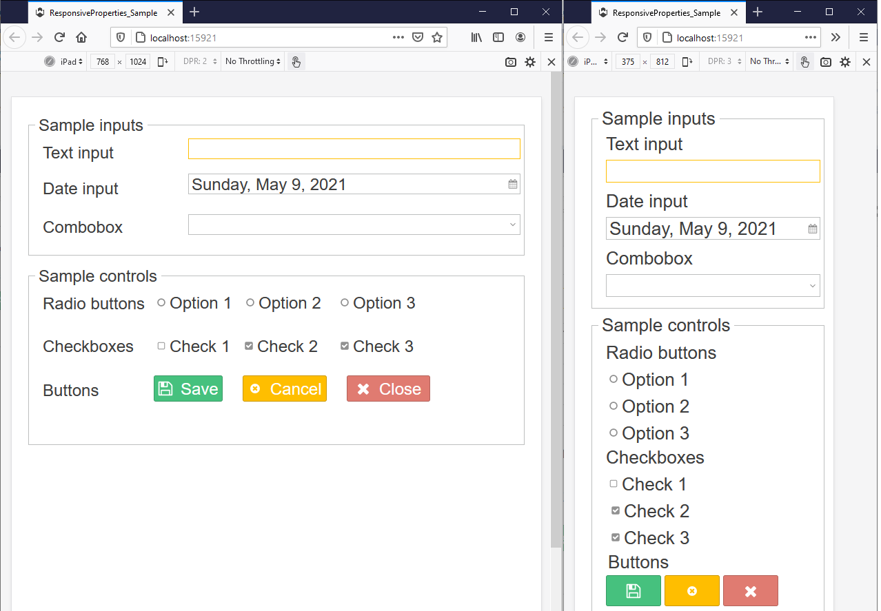
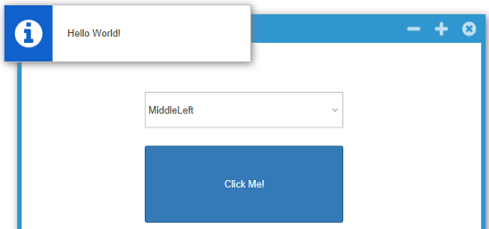
The following screens show the same form with different design for each profile: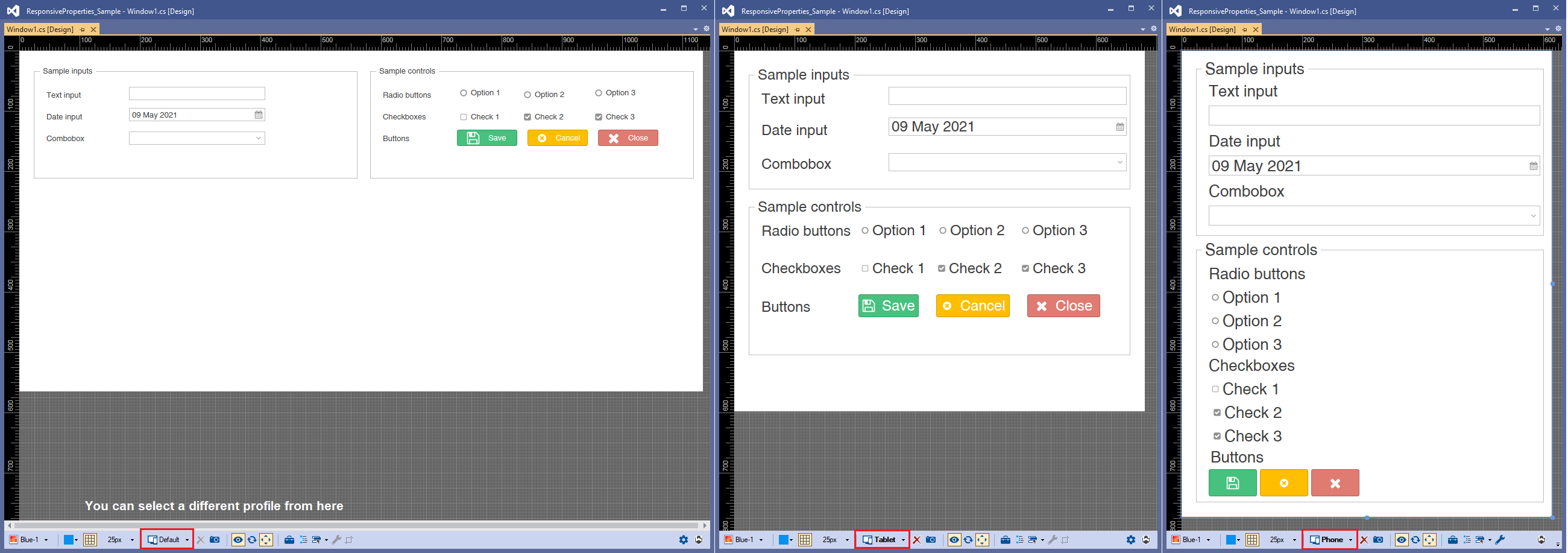
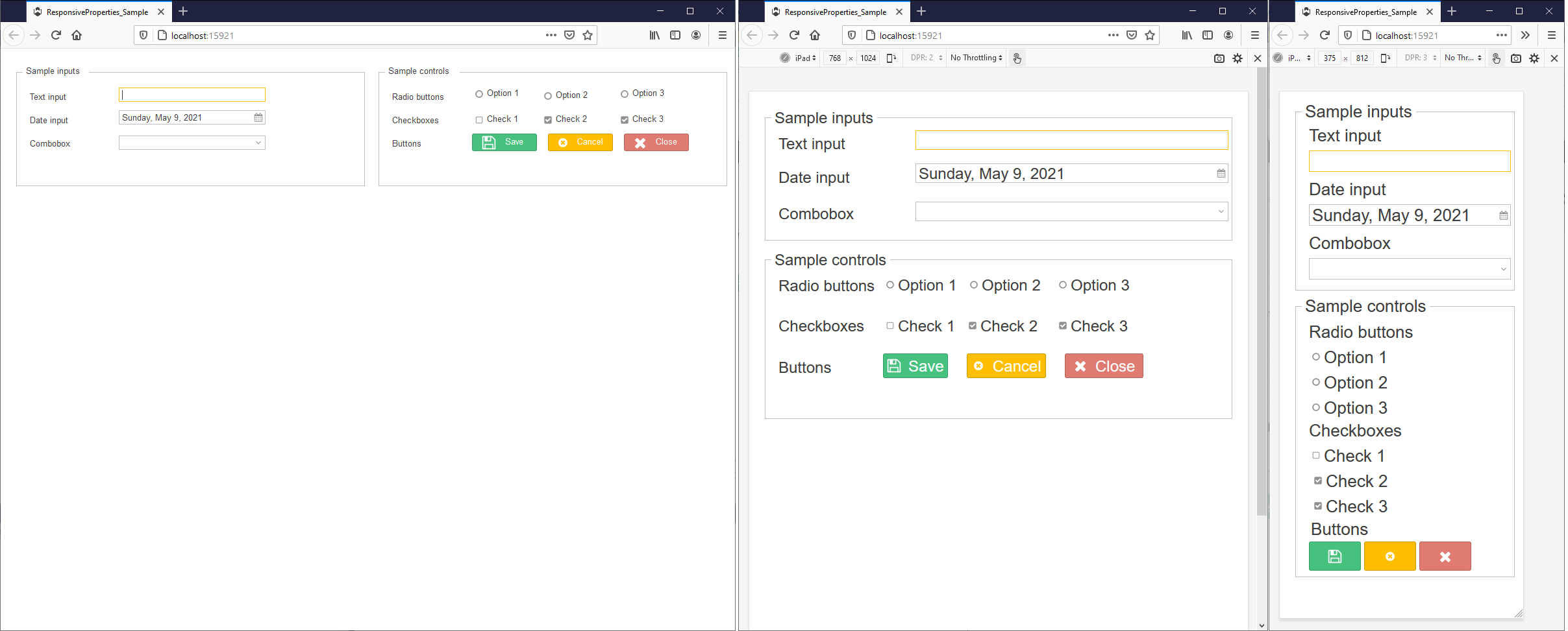
In this sample, the Font, Anchor, Location, Size and Text properties has different values in the responsive profiles.
Additionally, and depending on the control type, some other properties can have different values for each profile:
- Visible, Dock properties for any type of Control
- TextAlign, ImageAlign for Button
- Collapsed, ShowCloseButton for Groupbox
Download now and try for yourself: Responsive Properties Sample (Zip file)